wardmundy
Nerd Uno
- Joined
- Oct 12, 2007
- Messages
- 19,199
- Reaction score
- 5,218
So what has been going on? Well let me warn you that when you load the 2.10 beta be prepared for a lot of great things and some really big changes on the "look and feel" front. Let me also precede this by saying WE WANT TO HEAR YOUR FEEDBACK! This is not a "done deal" but we need to hear from you now to affect change, not 3 months after final release! (and if you do scream then, we are going to point you right back to this blog post!)
Upon loading the beta you are going to find that the whole GUI has gone though a MAJOR facelift. Kudos to some awesome work by mbrevda whose efforts started back in 2.9 to make this a reality and here we are today with a MUCH NEEDED modernization of the interface. With that said we are well aware that this sort of change may not suite everyone and further more, with a large community like we have, there is probably NO single solution that will make everyone happy.
I am not sure if this is the appropriate forum for comments on the interface, if not apologies in advance. Thank you for providing a public facing demo system, I expect this will be my only exposure to 2.10 for quite a while.
Those were just my first impressions of the retooled interface. I didn't actually try to use anything, just browsed the new look
- I like the new look, it has a bit more polish than what we are used to, but personally, I attach very low importance to aesthetics for something like this.
- I like the quick language selector, and seems to work well for the three that I struggle with.
- The frog logo at the top left has a link to nowhere, but I assume it will link to freepbx.org, there is a link to freepbx.org in the admin menu and a frog logo at bottom left that will likely link as well. Given the prominent location of the two logos, I don't see value in the third link in the admin menu.
- The placement of the individual items in the menus seems a bit arbitrary. The new system classifies conferences as an application but the parking lot is accessed via the setting menu and followme is placed in the other menu. In pre 2.10 versions, all of these are accessed the same way, and to my mind at least, makes more sense that way. I don't see any logic that clearly separates items that now appear in the admin, applications, other and settings menus.
- The connectivity menu does have menu items that are logically related to connectivity, which is nice. Consideration should be given to moving extensions in to this menu.
- Reports menu works exactly as I would expect it to.
- I assume the non-working user panel button is for FOP/FOP2 and if so, it is a good placement for me.
- What kind of mechanism will be in place for 3rd party modules, which menu will they appear in when installed?
I completely agree with number 4. Menus are, IMO, in a strange organizational structure. I don't like them at the top, personally.4. The placement of the individual items in the menus seems a bit arbitrary. The new system classifies conferences as an application but the parking lot is accessed via the setting menu and followme is placed in the other menu. In pre 2.10 versions, all of these are accessed the same way, and to my mind at least, makes more sense that way. I don't see any logic that clearly separates items that now appear in the admin, applications, other and settings menus.
5. The connectivity menu does have menu items that are logically related to connectivity, which is nice. Consideration should be given to moving extensions in to this menu.
6. I assume the non-working user panel button is for FOP/FOP2 and if so, it is a good placement for me.
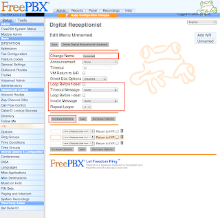
On the IVR screen, "IVR Options (DTMF)" settings have nothing to do with DTMF.
Indeed - although not here. The proper place to make your self heard is at freepbx.org, in the forums or you can comment directly on the blog post.MORAL: Speak now or forever hold your peace!
Yes I just added the 2.10 as a version in trac for FreePBX. Feel free to open a bug against the 2.10 version.
At this time the dropdown menu in FreePBX 2.10 requires you to click on the menu option in order to dropdown.
Link up your team and customers  Phone System Live Chat Video Conferencing
Hosted or Self-managed. Up to 10 users free forever. No credit card. Try risk free.

Check your inbox!
We’ve sent you an email. Click on the button in the email body to verify your email address – (if you can not find it, check your spam folder).
Upon verification you will be directed to the 3CX setup wizard.